Dark colors, particularly charcoal grey and black trim, have become popular amongst people who love minimalist house decór. Be it indoors or outdoors, these darker shades combine well with a light shade to create a nice contrast. When done with a fair amount of dexterity, the combination typically oozes serenity and simplicity.
If you’ve been looking to paint your house dark grey but are unsure of what would fit, you’re on the right page. Below, we share 9 charcoal grey home styles – all with black trim.
1. Balanced Modern
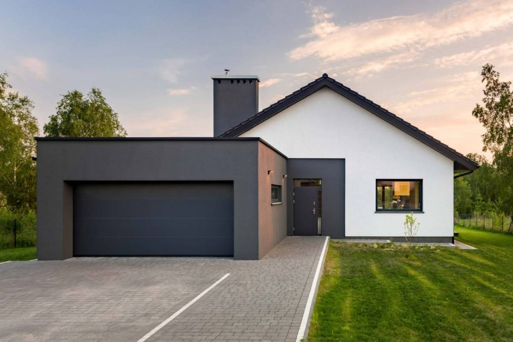
The design and color palette of this house emphasize what most people look for in a modern home design. It has a clean shape, closed shapes, and an overall sense of simplicity.
A fair bit of the house, including the main part, is covered in bright colors. But the darker shades of the trim, the garage, doors, and the roof counterbalance them. Overall, this style is a great example if you love a sense of balance in your home decór.
2. Illumined Midnight
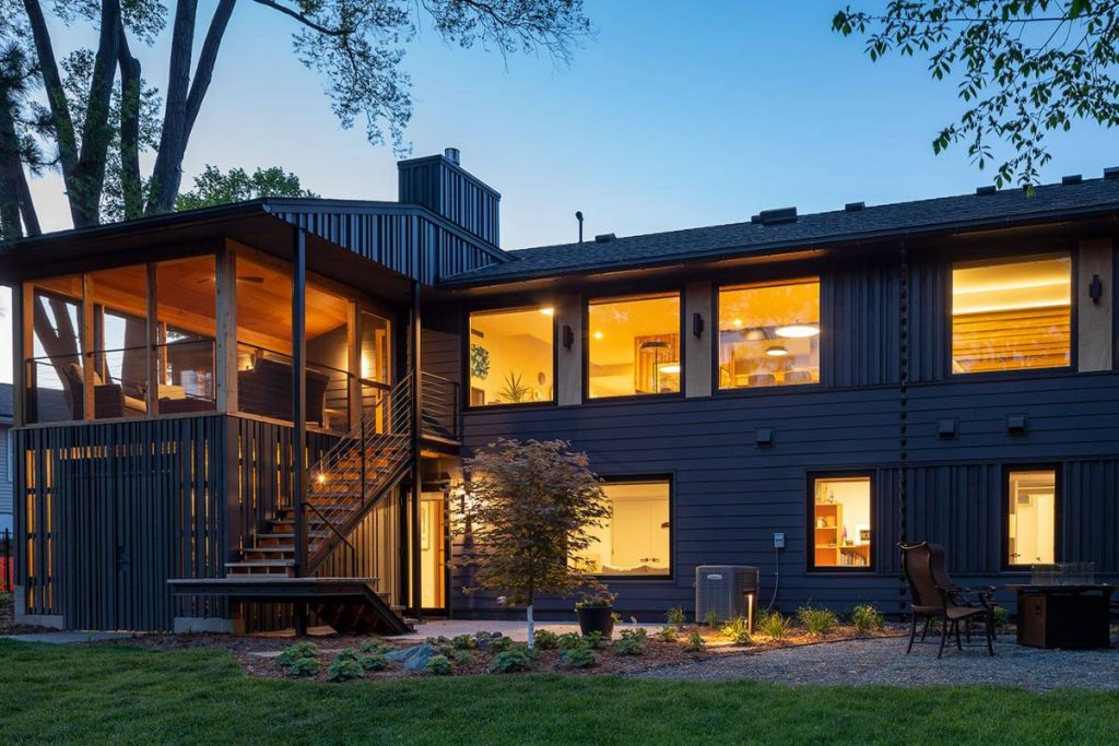
The many windows in this building are one of the hallmarks of modern home styles. They introduce openness to the structure, making it hard to feel cramped in the house.
The structural style aside, the use of grey roofs and siding alongside warm lights is one of the best ways to combine dark shades and light ones. Through their austerity, the dark colors act as accent colors to the warm light from the bulb. In other words, they make the lights look warmer.
Worthy of note is the flooring, which adds an extra facet to the color palette. Removing the grey flooring wouldn’t affect the design. But having it there makes the design bold while adding some gradient.
3. Light Stone, Grey Siding

This home gives us another great example of how to use black and grey as accent colors for a light shade.
The amount of light and dark colors in this style is just enough for a nice contrast. The overall feeling is reminiscent of ease and composure as the light stone slots in well between the black doors, black trim, grey wood siding, and grey roof.
While the structure is predominantly a modern home, the wall stones add some antiqueness. All in all, the touch of modern and antique will do more than enough to tickle anyone’s visual interest.
4. Only Dark Shades
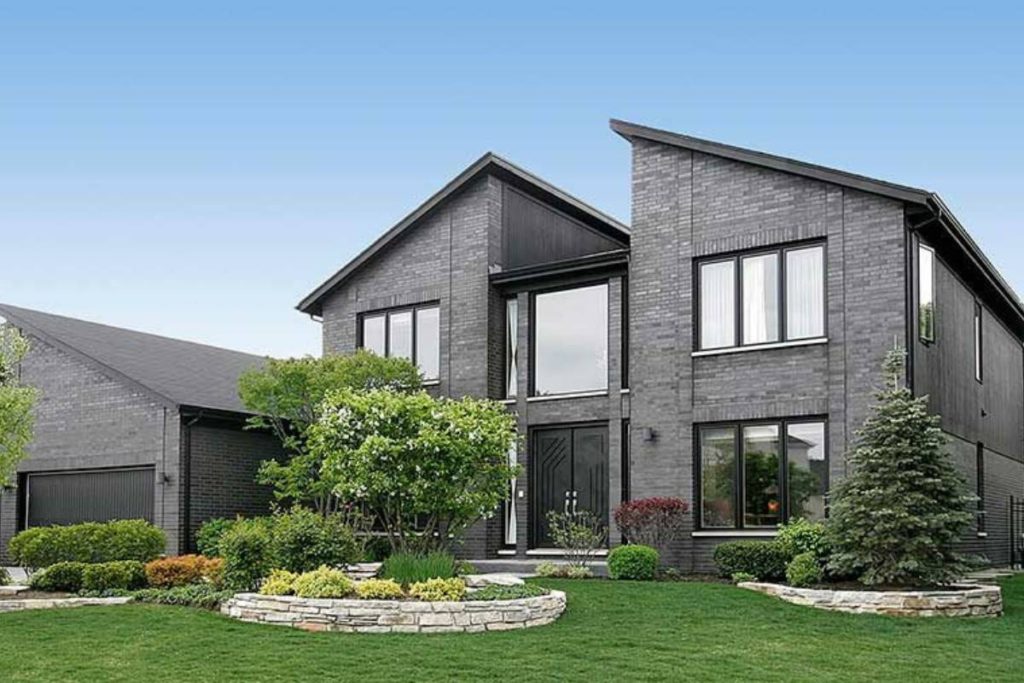
While the typical modern home uses wood siding, this building took the path less traveled – brick. One might argue that bricks are a thing for traditional home designs. But the geometry of this structure (especially the roof), the openness, starkness, and the bareness of the materials give it a modern touch.
The colors here do not have bright colors to contrast with. Yet, the trim still serves as an accent color to the grey brick.
The varying hues of the bricks add some dimension to the structure, much like these grey houses. It wouldn’t be so easy to achieve such detail with many other colors.
5. Deep Granite

While this building combines more than two colors – something unusual for modern styles – it pulls it off quite nicely. Thanks to the muted nature of all the colors, they blend in just fine.
The upper half of this structure sticks to light grey and deep granite hues, giving a familiar contrast. However, the lower half steps away from usualness; it combines brown with black, grey, and off-white.
In the lower half, the black trims and grey roof are accent colors for the brown wood. But the bricks serve as the accent color for the off-white mortar joints.
Limiting the surface area of the off-white color to the mortar joints was a masterstroke. If the off-white covered a larger area, this combination may not have worked.
If you want to get creative with the colors here, you could replace the brown with forest green. You could also try white, off-white, or other similar hues.
6. Textures and Colors
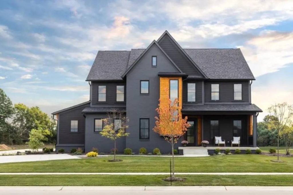
Dark colors are typically accent colors to light colors. But this building shows us the reverse. Here, the light brown/orange sidings contrast deeply with the black and grey areas, creating a classy, self-assured appearance.
Beyond the combination of the two colors, the texture of the materials adds extra visual interest to the structure. From the coarse texture of the roof to the stripe-like pattern and near-smooth texture of the walls, the structure isn’t monotonous in any way. So, while charcoal grey is the dominant color, there are many facets to the building.
7. Grey Hues
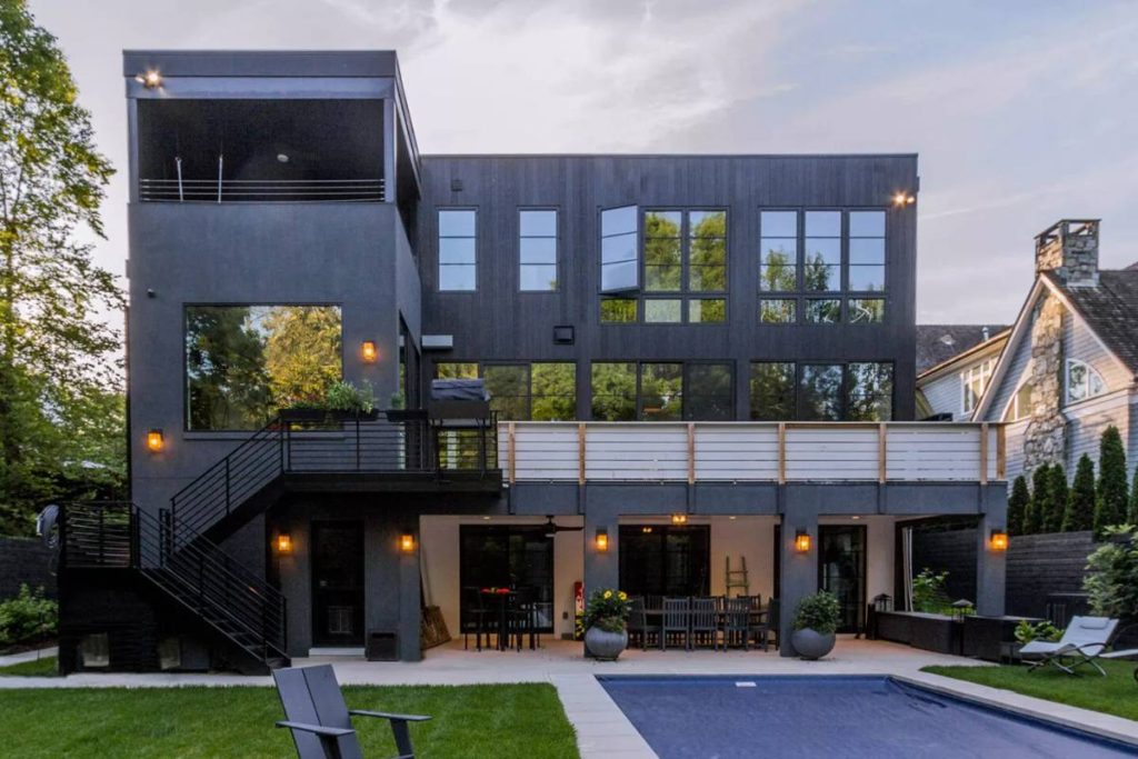
Here’s another building that makes use of multiple muted colors and one bright color to create visual depth while maintaining minimalism. Unlike the previous building, this uses multiple hues of grey paint, black, and off-white – no brown.
Black and off-white act as the accent colors in this style, while grey is the base color. Then the light stone floor provides just the right amount of reinforcement to the off-white railings, ensuring the vibrance is not lost.
There’s an abundance of greenery in this home style. While the plants and grasses may not seem significant at first, they add the calmness of the natural world to the mix.
8. More Texture, More Colors
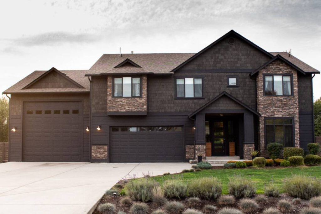
From the roof to the wood, wall stones, doors, trim, and sidings, there’s a color or texture gradient in every part of this building. Ordinarily, this could have tended the style towards maximalism. But the contrast between the colors is just right. So, in the end, we have the bold antique details merging into the austerity of modern design.
9. Everything Rustic
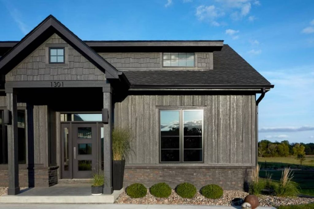
Without the weathered-grey wood, this building may have turned out too dim or dull. But with it, there’s a fair hint of vibrance and contrast, ensuring it isn’t all too cold.
