

Measure 57-60 inches from the floor to the center of your artwork—this eye-level sweet spot works in nearly every room and creates an instant gallery-worthy look. Map your entire layout on the floor first, experimenting with spacing and arrangement until it feels right, then measure the distances between each piece before transferring those exact measurements to your wall using painter’s tape as guides. Maintain 2-3 inches of space between frames for a cohesive gallery wall, or go wider with 4-6 inches for a more relaxed, breathing room between larger statement pieces.
The difference between a wall that looks professionally curated and one that feels haphazard often comes down to just a few inches and a solid plan. Whether you’re creating a symmetrical grid of family photos above your sofa or an eclectic salon-style collection in your hallway, understanding basic layout principles transforms intimidating blank walls into confident design statements. You already have the creativity—now you just need the practical framework to bring your vision to life without the guesswork, multiple nail holes, and frustration that comes from winging it.
Why Most Gallery Walls Fail (And What Works Instead)
We’ve all been there—excitedly hammering nails into the wall, only to step back and realize your carefully chosen artwork looks more chaotic than curated. The truth is, most gallery walls fail for surprisingly simple reasons, and understanding these pitfalls is your first step toward creating a display that looks effortlessly professional.
The most common mistake? Spacing issues that throw off the entire composition. When frames are too far apart, your gallery wall loses its cohesive feel and appears disconnected. Too close together, and it feels cramped and cluttered. The sweet spot typically ranges between 2 to 3 inches between frames, creating visual unity while letting each piece breathe.
Another culprit is the mismatched frame dilemma. While mixing frame styles can absolutely work, there’s a fine line between eclectic and messy. Without a unifying element—whether that’s consistent matting, complementary colors, or a cohesive theme in your artwork—your wall can quickly look like a hodgepodge rather than an intentional design choice.
Then there’s the height placement problem that plagues even well-intentioned DIYers. Hanging artwork too high is the number one error that screams amateur. The golden rule? Center your gallery wall at eye level, typically 57 to 60 inches from the floor to the center of your arrangement. This matches standard museum practices and creates an immediately pleasing viewing experience.
But here’s the good news: once you understand these common mistakes, the solution becomes clear. Professional-looking gallery walls follow three core principles. First, plan before you commit—lay your arrangement on the floor or use paper templates on the wall. Second, establish visual balance by distributing weight and color evenly throughout your composition. Third, create connection through repetition, whether it’s frame finish, color palette, or subject matter. These interior designer secrets transform random pictures into stunning focal points that elevate your entire space.
Popular Gallery Wall Layout Styles That Actually Work
The Grid Layout: Clean and Modern
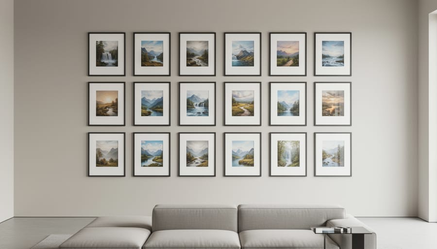
If you love symmetry and order, the grid layout is calling your name. This timeless approach arranges frames in neat rows and columns, creating a polished, gallery-worthy display that works beautifully in formal living rooms, home offices, or above a console table. The key to nailing this look is consistency—choose frames of identical size and color, then space them evenly (typically 2-3 inches apart both horizontally and vertically).
Start by determining your grid dimensions. A 3×3 or 2×4 arrangement often looks balanced on larger walls, while a simple 2×2 grid suits smaller spaces perfectly. Use painter’s tape to mark your exact placement before hammering a single nail. This structured approach works especially well with black-and-white photography or a cohesive art collection where the uniform presentation lets the content shine.
Pro tip: Measure from the center point of your wall and work outward to ensure perfect alignment. If precision isn’t your forte, consider purchasing a multi-frame set with a template included—it takes the guesswork out of spacing while delivering that crisp, modern aesthetic you’re after.
The Salon Style: Eclectic and Personal
If you’re drawn to the collected, lived-in look of art galleries and European apartments, the salon style might be calling your name. This approach embraces organized chaos, covering entire walls from near the floor to the ceiling with frames of varying sizes, styles, and subjects. It’s wonderfully personal and tells a story through your collection.
The key to pulling off salon style without creating visual mayhem is finding balance within the variety. Start by establishing an anchor piece, usually a larger frame positioned at eye level, then build outward from there. Maintain relatively consistent spacing between frames (about 2-3 inches works well) to create rhythm even amid the eclectic mix. Think of the spacing as the glue that holds everything together.
Consider color as your unifying element too. Whether it’s consistent frame colors, a cohesive color palette in the artwork itself, or matting that ties pieces together, this thread of continuity prevents the arrangement from feeling scattered. Lay everything out on the floor first, experimenting with placement until the composition feels balanced, with visual weight distributed evenly across the wall.
The Linear Layout: Simple and Sophisticated
Sometimes the most impactful designs are the simplest ones. The linear layout arranges pictures in a single, crisp horizontal or vertical line, creating a clean and sophisticated look that works beautifully in challenging spaces.
This layout shines in hallways where wall space is limited but long. A horizontal line of three to five frames draws the eye down the corridor and makes narrow passages feel more intentional and gallery-like. Above a sofa or console table, a horizontal arrangement anchors the furniture perfectly while maintaining visual balance. Just align the centers of your frames and maintain consistent spacing between each piece, typically 2-3 inches.
Vertical lines work wonders beside doorways, along staircases, or in slim wall sections between windows. They add height to rooms and create visual interest in spots you might otherwise overlook.
The key to nailing this layout is using a level and measuring carefully. Start by finding your center point, then work outward to ensure even spacing. For the most polished look, keep your frame sizes uniform or use a consistent theme, like all black-and-white photos or matching mat colors.
The Statement Piece Plus Supporting Cast
Think of this arrangement as the rock star and the backup band—one piece commands attention while the others enhance the show. Start by selecting your hero piece, typically a larger artwork or cherished photograph that measures at least 24×36 inches. Position it at eye level (around 57-60 inches from the floor to the center) where it naturally draws the gaze.
Now comes the fun part: arranging your supporting cast. Place 4-6 smaller pieces around your focal point, keeping them within an imaginary boundary that extends about 3-8 inches from each edge of the main piece. These companions should complement your statement piece in color, theme, or mood without competing for attention. Mix frame sizes and orientations—perhaps a few 8x10s with some 5x7s—to create visual interest.
Here’s a pro tip that saves headaches: lay everything on the floor first and snap a photo from above. This bird’s-eye view reveals balance issues before you hammer a single nail. Maintain consistent spacing of 2-3 inches between pieces for a cohesive look that feels intentional rather than cluttered.
The Paper Template Method: Plan Before You Hammer
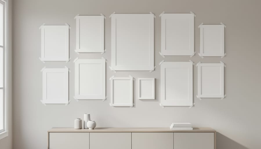
Here’s the secret that will save your walls from looking like Swiss cheese: test your layout with paper templates before picking up that hammer. This simple technique is a game-changer, and you’ll wonder why you didn’t try it sooner.
Start by tracing each frame onto kraft paper, butcher paper, or even newspaper. Place the frame face-down on your paper and trace around its outer edges. Don’t forget to mark where the hanging hardware sits on the back with an X or dot, since this is where your nail will actually go, not the top edge of the frame.
Cut out your paper templates and grab some painter’s tape or masking tape. The beauty of using tape is that it won’t damage your walls or leave sticky residue behind. Now comes the fun part: arranging your layout directly on the wall. Step back frequently to evaluate your composition from different angles and distances. This is your chance to play around without commitment.
Adjust the spacing between pieces until it feels just right. Move templates up, down, or sideways as many times as needed. Living with the paper layout for a day or two can be incredibly helpful, especially if you’re tackling a large gallery wall. You’ll notice things in different lighting that you might have missed initially.
Once you’re satisfied with the arrangement, mark your hanging points through the paper templates. Make small pencil marks where those X marks sit, then carefully remove the paper. Your marks show exactly where to place your nails or hooks, eliminating guesswork and ensuring your vision translates perfectly from plan to reality.
Spacing and Height Rules That Professional Designers Follow
The 57-Inch Rule and Eye-Level Placement
Here’s the golden rule that professional designers swear by: hang your artwork so the center sits at 57 inches from the floor. This measurement comes straight from museum standards and represents the average human eye level, creating a natural, comfortable viewing experience for most people.
Think of the 57-inch rule as your trusty starting point rather than an inflexible law. When you’re hanging pictures above a sofa, console table, or headboard, you’ll want to adjust downward. A good guideline is to position the bottom of your frame about 6 to 8 inches above the furniture piece. This creates visual connection between your art and the furniture without leaving an awkward gap or making the artwork feel like it’s floating away.
In dining rooms where people are mostly seated, consider dropping your artwork a few inches lower than the standard 57 inches so diners can actually enjoy it. The same goes for hallways where you might be viewing art while walking, and children’s rooms where little eyes appreciate art hung at their level.
Remember, these guidelines exist to help you, not limit your creativity. If your family tends to be taller or shorter than average, adjust accordingly. The goal is creating a space that feels balanced and welcoming to the people who actually live there.
Spacing Between Frames: The 2-3 Inch Sweet Spot
Getting the spacing right between your frames makes all the difference between a polished gallery wall and a cluttered mess. The magic number? Aim for 2 to 3 inches between each frame. This sweet spot creates breathing room while maintaining a cohesive, intentional look that ties your arrangement together.
Think of this spacing as the visual glue that helps your eye move smoothly from one piece to the next without getting overwhelmed. Too close, and your beautiful artwork starts competing for attention. Too far apart, and your carefully planned layout looks disconnected and awkward.
Here’s a practical tip: cut strips of painter’s tape in 2 or 3-inch widths and use them as spacers when positioning your frames. This hands-on approach takes the guesswork out of measuring and lets you see exactly how the spacing feels before committing to nail holes. For larger walls or oversized pieces, you can stretch toward the upper end of that range, but resist going beyond 3 inches unless you’re deliberately creating separate groupings. Consistency is your friend here, so once you choose your spacing measurement, stick with it throughout your entire arrangement for that cohesive, designer-approved finish.
Working Around Furniture: Sofas, Beds, and Consoles
When hanging art above furniture, the magic number is 4-8 inches of clearance between the furniture top and your frame’s bottom edge. This creates visual connection without making pieces feel cramped or disconnected. For sofas and beds, center your arrangement horizontally with the furniture piece itself, not the entire wall. Your artwork or gallery wall should span roughly two-thirds the width of the furniture below it—this proportion prevents pieces from looking lost or overwhelming the space.
Console tables work similarly, though you can go slightly narrower since they’re less visually dominant. Just like living room placement rules for other furnishings, balance is everything. If you’re working with a king-size bed, a single 16×20 print will look lonely—consider a larger statement piece or a three-frame horizontal arrangement instead. Pro tip: lay your arrangement on the floor behind your sofa first to visualize scale before committing to nail holes.
Creating Visual Balance Without Matching Frames
You don’t need matching frames to create a stunning wall display—in fact, mixing different styles often results in a more interesting and personalized gallery. The key is understanding how to bring diverse elements together so they feel intentional rather than random.
Start by choosing a unifying color palette for your overall display. This doesn’t mean everything should be the same color, but selecting frames and artwork that share two or three complementary colors creates natural harmony. For example, you might combine black, white, and natural wood frames with artwork that features similar accent colors. This approach to color coordination ties everything together visually, even when frame styles vary wildly.
Mat choices offer another powerful tool for cohesion. Using consistent mat colors across different frame styles creates a clean, gallery-like appearance. White or cream mats work particularly well for this purpose, acting as visual breathing room that helps varied frames feel connected. Alternatively, you can skip mats entirely for a more casual, eclectic vibe.
Pay attention to visual weight distribution across your wall. Heavier, darker frames naturally draw the eye, so balance them with lighter pieces on the opposite side of your arrangement. Think of it like a seesaw—you wouldn’t put all the heavy items on one end. Mix ornate frames with simple ones, and vary the artwork types between photographs, prints, and perhaps a small mirror or dimensional piece.
A helpful trick is to step back frequently while planning. Take a photo with your phone to see how everything reads from a distance. Sometimes combinations that seem mismatched up close work beautifully when viewed from your couch or entryway, which is exactly where you’ll appreciate them most.
Room-by-Room Gallery Wall Ideas
Living Room: Make a Bold Statement
Your living room deserves a gallery wall that stops guests in their tracks. Consider a statement grid layout above your sofa using 6-9 frames in identical sizes for a sophisticated, museum-quality feel. Alternatively, try a salon-style arrangement that mixes frame sizes and orientations to showcase personality and create visual intrigue. Position your layout so the center sits at eye level, typically 57-60 inches from the floor. Don’t be afraid to go big—leaving too much blank space around your arrangement can make it feel disconnected from the furniture below. For more guidance on pulling your room together, check out these beginner decorating tips that complement any gallery wall project beautifully.
Bedroom: Keep It Calming
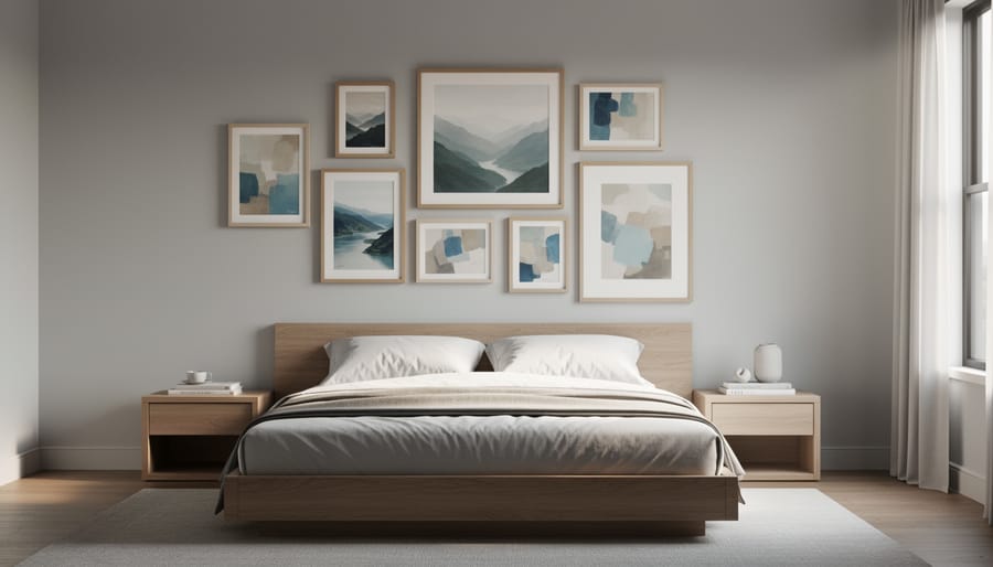
Your bedroom should feel like a peaceful retreat, so choose softer picture layouts that promote relaxation rather than visual stimulation. Above the bed, consider a simple horizontal arrangement of two or three matching frames, or a single oversized piece that anchors the space without overwhelming it. Keep spacing generous—about 4 to 6 inches between frames works beautifully here. For dressers, a leaning gallery approach feels effortless and calming, with layered frames resting casually against the wall. Stick to soothing color palettes in your artwork, like soft blues, warm neutrals, or gentle greens. Avoid overly busy arrangements or high-contrast images that might energize rather than soothe.
Hallways and Stairways: Maximize Vertical Space
Hallways and stairways often get overlooked, but these transitional spaces are perfect for creating striking vertical galleries. Since you’re dealing with narrow walls and limited floor space, think upward! A vertical column arrangement works beautifully along stairway walls, following the angle of the stairs to create natural flow as people move through the space.
For straight hallways, consider a single vertical line of frames at eye level, spaced 2-3 inches apart. This draws the eye forward and makes the space feel longer. If your hallway is particularly narrow, choose smaller frames (5×7 or 8×10) to avoid overwhelming the space.
Stairway walls present a unique opportunity to play with diagonal arrangements. A useful trick: measure 60 inches from each stair tread and mark those points to establish your center line. This ensures your pictures maintain consistent viewing height as you ascend.
Don’t shy away from mixing frame sizes in these vertical arrangements. The key is maintaining equal spacing between frames, which creates cohesion even when dimensions vary. These often-forgotten spaces can become your home’s most memorable gallery walls with just a little creative planning.
Creating a stunning gallery wall is more than just filling empty space—it’s about transforming a room and telling your unique story through the images and artwork you love. The beauty of a thoughtfully designed picture layout lies in its ability to completely shift the atmosphere of any room, turning a blank wall into a captivating focal point that reflects your personality and style.
If you’re feeling overwhelmed about where to begin, remember that the paper template method is your best friend. By tracing each frame and arranging the templates on your wall first, you eliminate guesswork and avoid unnecessary holes. This simple technique gives you the freedom to experiment without commitment, letting you visualize different arrangements until you find the one that feels just right.
Don’t forget that your gallery wall isn’t set in stone. As your life evolves, so can your display. Feel free to swap out photos, add new pieces, or rearrange existing frames to keep your wall fresh and meaningful. The most successful gallery walls are living collections that grow and change alongside you. So grab those frames you’ve been storing away, trust your creative instincts, and start building a display that truly feels like home.


